How Unusual was the Portland, OR, high temperature on June 28th?
[mathematics statistics climate-change R In late June, I wrote a short post to capture the feeling of meteorologists’ disbelief at the temperature forecasts for the Pacific Northwest (PNW) for late June 2021. Their reactions to the forecasts shows the clash between our weather expectations from experience and the new reality of global climate change. In this post, I look at the tempon June 28 and put it into a historical context using some statistics (and R).
What I wanted to do was get a record of the daily high temperatures on June 28th in Portland, OR, and see how unusual a high of 115°F on the 28th would be.
(A secondary purpose of this post is to show how to fit a probability distribution to data and visualize it using relatively basic R tools. I’m grateful for Vito Ricci’s “Fitting Distributions with R” for techniques for fitting distributions to temperature data. A copy of the Rmarkdown file that created this post can be found here.)
Historical Temperature Data
To get historical data on the daily high temperatures in Portland, OR, I went to the web site for NOAA’s National Centers for Environmental Information, and found their Climate Data Online page. I then searched their Daily Summaries data for Portland stations.
After some fiddling with choices (there is data from many weather stations in the Portland area), I downloaded this temperature data which included daily temperatures from the Portland Regional Forecast Office (from January 1, 1900 to June 30, 1973) and the Portland International Airport (from May 1, 1936 until June 30, 1971) and the Portland International Airport (from May 1, 1936 until December 31, 1999). For former has Station ID USW00024274 and the latter has Station ID USW00024229. I chose the dates to span the 20th century.
Once I had the data in CSV format (an option you have to specify on the
NOAA download page, otherwise you’ll get a useless PDF report), I saved
it as weather-temp-0099-portland.csv and imported into R.
library(readr)
df <- read_csv("weather-temp-0099-portland.csv")
I then did some R-foo to reformat the data variables (aka, column headers) to lowercase, dropped some irrelevant columns, and got rid of rows that had an ‘NA’ instead of a temp value.
library(dplyr)
df<-rename_with(df,tolower)
# drop irrelevant columns
df<-df[-c(5,7,8,10,12:14)]
library(tidyr)
df<-drop_na(df)
To isolate the annual daily highs on June 28th, I found a function in
the openair package and used it instead of rolling my own.
library(openair)
# for the SelectByDate function
# https://davidcarslaw.github.io/openair/reference/selectByDate.html
df628<-selectByDate(
  df,
  month = 6,
  day = 28,
)
Here you can see I save the data frame with a new name, indicating that
it’s the temps for June 28th. But these data set has temps from two
weather stations, the data from the two stations overlaps in time
(meaning that there are two temps for the same day for quite a few
days). So I teased the data apart by weather station using a dplyr
function.
# for station USW00024274
df1<-filter(df628,station=="USW00024274")

# for station USW00024229
df2<-filter(df628,station=="USW00024229")
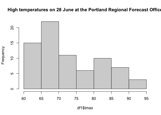
The data from the Portland Regional Forecast Office had 74 measurements and the data from the Portland International Airport has 62 measurement. The highest temperature recorded at both these sites is 95°F in 1951. The lowest high temperature on that day was 60°F and occurred in 1963, 1968, and 1971.
How Unusual is 115°F on June 28th?
The fact that a high temperature of 115°F had never occurred in Portland, OR, in recorded history makes the event unusual. But how unusual?
Let’s assume that the daily high temperatures follow a normal, or Gaussian, distribution (which we will see they don’t), we can come up with some rough estimates for the rarity of a 115°F day. We’ll look at how this temperature compares to the expected temperature on June 28th and how the temperatures on that date have varied, historically. Specifically, we’ll ask how 115&def;F compares to the mean temperature of June 28ths in terms of standard deviations of historic temperatures on that day.
First, we’ll look at what the data tells us to expect the daily high on 28 June to be in any given year. This expected value is the mean of the data sets, or
temp_ave1<-mean(df1$tmax)
temp_ave2<-mean(df2$tmax)
the values of which are 73.6756757°F and 74.8064516°F, respectively. The 2021 high exceeds both by over 40°F!
Second, we’ll express the record high in terms of the way our data is spread out, or its standard deviation. A standard deviation can be used as a unit to measure how far above or below a a value lies relative to a distribution’s center. Generally, events closer to a distribution’s center are more likely and events further away are less likely. The standard deviation for each data set is
temp_sd1<-sd(df1$tmax)
temp_sd2<-sd(df2$tmax)
or about 9.0343456°F and 8.9622866°F, respectively. This means our record high temperature is
df1n<-(115-temp_ave1)/temp_sd1
df2n<-(115-temp_ave2)/temp_sd2
or 4.5741359 and 4.4847426 standard deviations from the expected daily high temperature, respectively. This is huge!
Were the daily high temperatures distributed normally, we could use some
basic statistics to calculate the probability that June 28th in
Portland, OR, should have a high temperature of 115°F or higher. In R,
we can calculate those probabilities with the dnorm function:
pnorm(df1n)
pnorm(df2n)
returns 0.9999976 and 0.9999963, respectively. This means we’d expect a high temp of 115°F on 28 June about once every 27000 years.
This estimate is terribly rough, and we have little reason to have faith in it for two reasons. First, there’s nothing special about June 28th. We’d be just as troubled if a 115°F day had occurred on the 27th or 29th. So our estimate for the rarity of a of 115°F high is inflated. (It should be that rare.) Second, we used an assumption that our temperatures were normally distributed, but they aren’t.
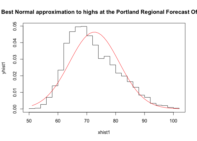
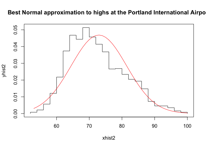
To see how incorrect that assumption is, take a look at the distribution of temperatures.
hist(df1$tmax, main="High temperatures on 28 June at the Portland Regional Forecast Office")
hist(df2$tmax, main="High temperatures on 28 June at the Portland International Airport")
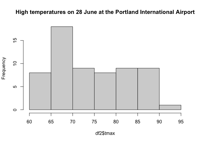
A normal distribution is symmetric about its ‘center’, or highest point. These distributions are not symmetric. They are both skewed right, having more mass above their ‘center’, and they have a tail that extends farther to the right than to the left. They also appear to be bi-modal, having two local maxima.
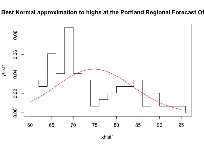
To see how poorly these distributions are described by a Gaussian, we use R to find the Gaussian of best fit for each dataset and plot those Gaussians against the data’s frequency histogram to get a qualitative feeling for how ‘good’ the Gaussian describes the data.
First, we establish our data sets, one for each weather station. We then find the normal distribution of best fit.
dg1<-df1$tmax
dg2<-df2$tmax

library(MASS)
pnormal1<-fitdistr(dg1,"normal")
pnormal2<-fitdistr(dg2,"normal")
Second, we calculate the histograms of each dataset so we can work with the frequency distribution of the temperatures and construct the the Gaussian of best fit for visualization.
h1<-hist(dg1,breaks=20);
h2<-hist(dg2,breaks=20);
xhist1<-c(min(h1$breaks),h1$breaks)
yhist1<-c(0,h1$density,0)
xfit1<-seq(min(dg1),max(dg1),length=max(dg1)-min(dg1)+1)
ynfit<-dnorm(xfit1,pnormal1$estimate[1],pnormal1$estimate[2])

xhist2<-c(min(h2$breaks),h2$breaks)
yhist2<-c(0,h2$density,0)
xfit2<-seq(min(dg2),max(dg2),length=max(dg2)-min(dg2)+1)
ynfit<-dnorm(xfit2,pnormal2$estimate[1],pnormal2$estimate[2])
Last, we visualize the data and the Gaussian of best fit, noting the Gaussians don’t describe the data very well at all.
{plot(xhist1,yhist1,type="s",ylim=c(0,max(yhist1,ynfit)),main="Best Normal approximation to highs at the Portland Regional Forecast Office")
lines(xfit1,ynfit,col="red")}
{plot(xhist2,yhist2,type="s",ylim=c(0,max(yhist2,ynfit)),main="Best Normal approximation to highs at the Portland International Airport")
lines(xfit2,ynfit,col="red")}
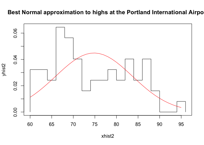
Pretty terrible, right?
Now let’s consider 115°F in the context of historical June temperatures, relaxing our fixation on the day of June 28th.
How Unusual is 115°F in June?
Pulling all the June data from our NOAA data
df6<-selectByDate(
  df,
  month = 6,
)
and isolating the temperatures by weather station
# for station USW00024274
df61<-filter(df6,station=="USW00024274")

# for station USW00024229
df62<-filter(df6,station=="USW00024229")
we see the high temperature in Junes was 102°F on June 30, 1942, and the lowest high temperature was 51. The expected high temperatures at the weather stations were 72.6130631 and 72.9354839, respectively. Our temp is 42.0645161 higher than these.
R makes it easy to calculate (not shown) that 115°F is 4.92 and 4.94 standard deviations above the expected high temperature for a June day in Portland, so a day that is that hot or hotter has about a 4.3272106^{-7} chance of happening on a given day in June June. That’s about once every 2,320,000 June days, or once every 75,000 years.
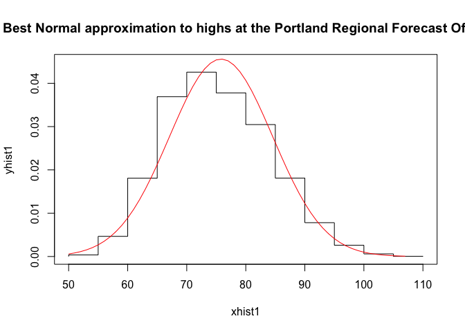
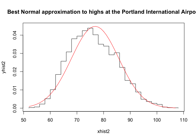
This assumes that temperatures follow a Gaussian distribution, and we already know that assumption is suspect. Let’s use R to make a visual check of this.
First, we establish our data sets, one for each weather station. We then find the normal distribution of best fit.
dg1<-df61$tmax
dg2<-df62$tmax

library(MASS)
pnormal1<-fitdistr(dg1,"normal")
pnormal2<-fitdistr(dg2,"normal")
Second, we calculate the histograms of each data set so we can work with the frequency distribution of the temperatures and construct the the Gaussian of best fit for visualization.
h1<-hist(dg1,breaks=20);
h2<-hist(dg2,breaks=20);
xhist1<-c(min(h1$breaks),h1$breaks)
yhist1<-c(0,h1$density,0)
xfit1<-seq(min(dg1),max(dg1),length=max(dg1)-min(dg1)+1)
ynfit1<-dnorm(xfit1,pnormal1$estimate[1],pnormal1$estimate[2])

xhist2<-c(min(h2$breaks),h2$breaks)
yhist2<-c(0,h2$density,0)
xfit2<-seq(min(dg2),max(dg2),length=max(dg2)-min(dg2)+1)
ynfit2<-dnorm(xfit2,pnormal2$estimate[1],pnormal2$estimate[2])
Last, we visualize the data and the Gaussian of best fit, noting the Gaussians don’t describe the data very well.
{plot(xhist1,yhist1,type="s",ylim=c(0,max(yhist1,ynfit)),main="Best Normal approximation to highs at the Portland Regional Forecast Office")
lines(xfit1,ynfit1,col="red")}
{plot(xhist2,yhist2,type="s",ylim=c(0,max(yhist2,ynfit)),main="Best Normal approximation to highs at the Portland International Airport")
lines(xfit2,ynfit2,col="red")}
We see that the Gaussian fits better than they did the previous dataset, but it’s not perfect. The mean of the Gaussian is a bit above the mode of the temperature distribution, and the right tail of the temperature distribution appears to lie above the right tail of the Gaussian. This suggests that our estimate of how unusual the high temperature is might be an underestimate.
What happens if we broaden the range of dates we consider even further? After all, high temperatures also occur in July, August, and September.
How Unusual is 115°F in June through September?
Repeating the above with the data set for daily high temperatures in June, July, August, and September,
dfsummer<-selectByDate(
  df,
  month = 6:9,
)
and separating out ot the records at the two stations
# for station USW00024274
dfsum1<-filter(dfsummer,station=="USW00024274")

# for station USW00024229
dfsum2<-filter(dfsummer,station=="USW00024229")
we see the high temperature during these months was 107°F on July 2, 1942, July 30, 1965, and August 8 and 10, 1981 and the lowest high temperature was 50. The expected high temperatures at the weather stations were 75.8188025 and 76.8212586, respectively. Our temp is 38.1787414 higher than these.
Even with a higher high temperature, we can calculate that 115°F is 4.4777521 and 4.2873669 standard deviations above the expected temperature during this period. So the probability that a day in June, July, August of September (a particular third of the year) has a high of 115°F or higher is 9.0401778^{-6}. That means that we expect a day to have this temperature once every 111,000 summer days, or once every 900 years.
This assumes that temperatures follow a Gaussian distribution, and we already know that assumption is suspect. Let’s use R to make a visual check of this.
First, we establish our data sets, one for each weather station. We then find the normal distribution of best fit.
dg1<-dfsum1$tmax
dg2<-dfsum2$tmax

library(MASS)
pnormal1<-fitdistr(dg1,"normal")
pnormal2<-fitdistr(dg2,"normal")
Second, we calculate the histograms of each data set so we can work with the frequency distribution of the temperatures and construct the the Gaussian of best fit for visualization.
h1<-hist(dg1,breaks=20);
h2<-hist(dg2,breaks=20);
xhist1<-c(min(h1$breaks),h1$breaks)
yhist1<-c(0,h1$density,0)
xfit1<-seq(min(dg1),max(dg1),length=max(dg1)-min(dg1)+1)
ynfit1<-dnorm(xfit1,pnormal1$estimate[1],pnormal1$estimate[2])

xhist2<-c(min(h2$breaks),h2$breaks)
yhist2<-c(0,h2$density,0)
xfit2<-seq(min(dg2),max(dg2),length=max(dg2)-min(dg2)+1)
ynfit2<-dnorm(xfit2,pnormal2$estimate[1],pnormal2$estimate[2])
Last, we visualize the data and the Gaussian of best fit, noting the Gaussians don’t describe the data perfectly, but they’re better in this case than either of the previous.
{plot(xhist1,yhist1,type="s",ylim=c(0,max(yhist1,ynfit)),main="Best Normal approximation to highs at the Portland Regional Forecast Office")
lines(xfit1,ynfit1,col="red")}
{plot(xhist2,yhist2,type="s",ylim=c(0,max(yhist2,ynfit)),main="Best Normal approximation to highs at the Portland International Airport")
lines(xfit2,ynfit2,col="red")}
These plots show this set of daily high temperatures over a longer part of the year is much closer to a Gaussian distribution, so we can feel more comfortable with the high temp on June 28th was a “one in 800 year” event, at least in the context of 20th century records for Portland, OR.
Conclusion
Even though these methods used a very sketchy normality assumption, the investigation shows that Portland, OR, having a high of 115°F is historically very unlikely to happen. Even climate change skeptics should look at this as undeniable evidence that something is changing in the world around us to make events like this happen more often than this historical record says they should be happening.
Updates: week of 9 July 2021
The Washington Post published this article today, “Pacific Northwest heat wave was ‘virtually impossible’ without climate change, scientists find”. They don’t do this statistical analysis, but they do suggest this is a (retrospective) 1000-year event that threatens to become a once in a decade event.
Buzzfeed news published an article “In Case You Had Any Doubts, Scientists Found Climate Change Was Definitely Behind The Deadly Pacific Northwest Heat Wave”” that cites scientists describing the PNW heatwave as a 1-in-a-1000 year event made possible by global climate change.